Ribeira
Lead Designer
Branding
UX/UI Design
Year
Roles
2022-2024

When I joined the team I was assigned into the mantle of Lead Designer, my first task was a complete rebranding, along with establishing the brand’s guidelines, look and feel for social media, PR and server-side assets.
From that point, I’ve since began re-working and creating new UI/UX elements, and guidelines to have everything align to the brand feel, and have a cohesive and unique look to all sides of this server.
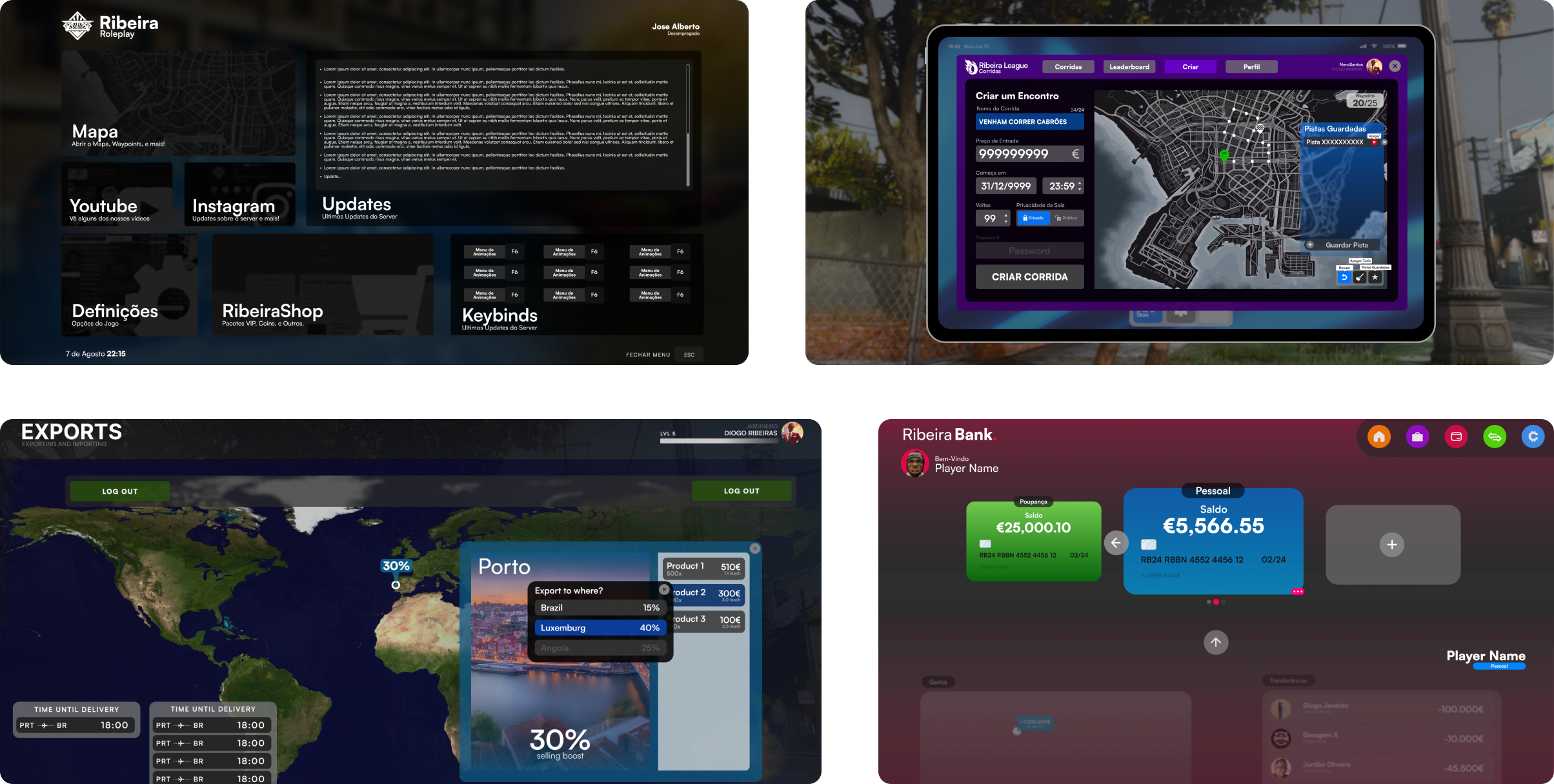
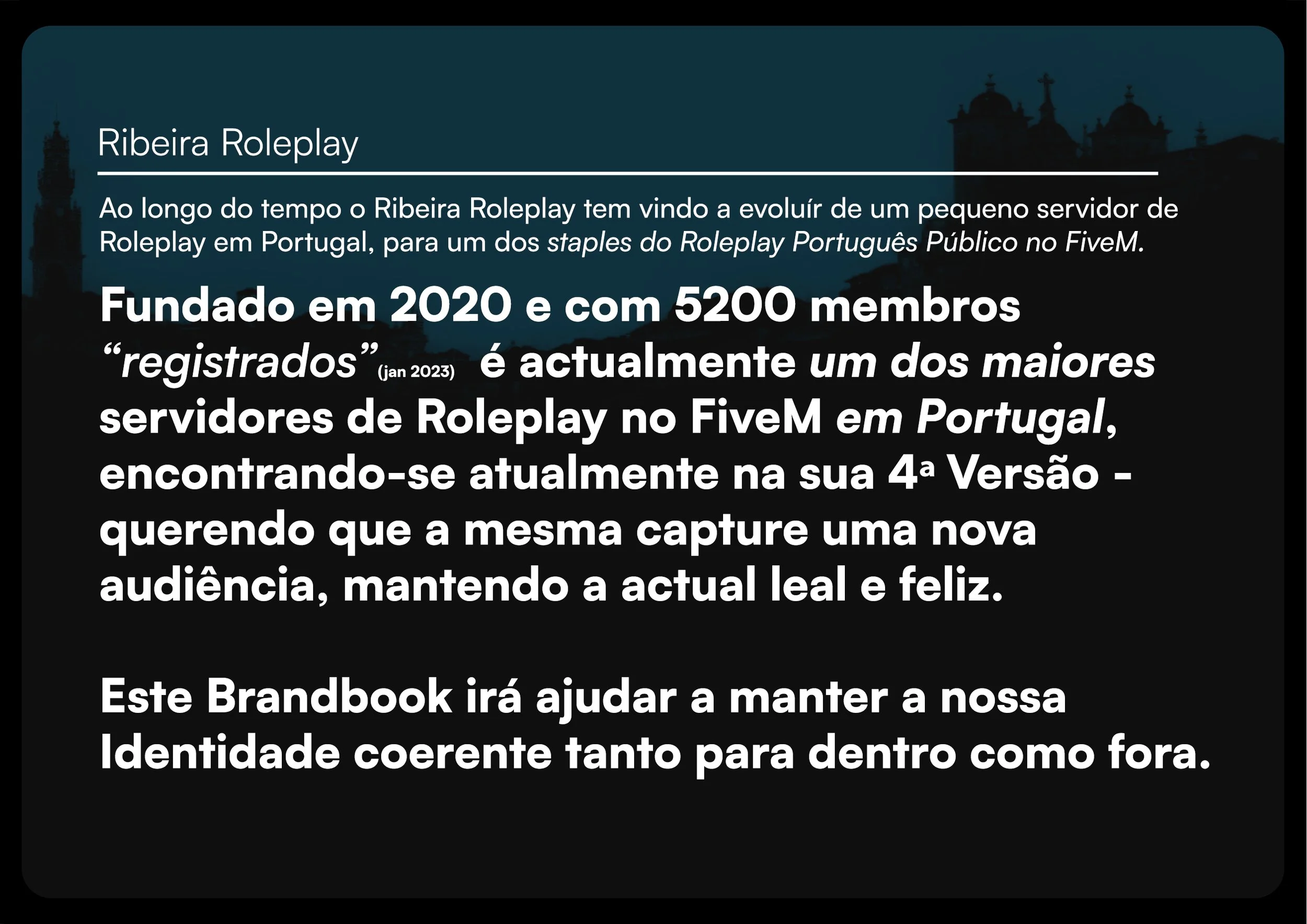
Ribeira Roleplay is a FiveM (Multiplayer Framework for GTA V) server established in 2020, it counts with over 20 staff members and about 6000 registered users.
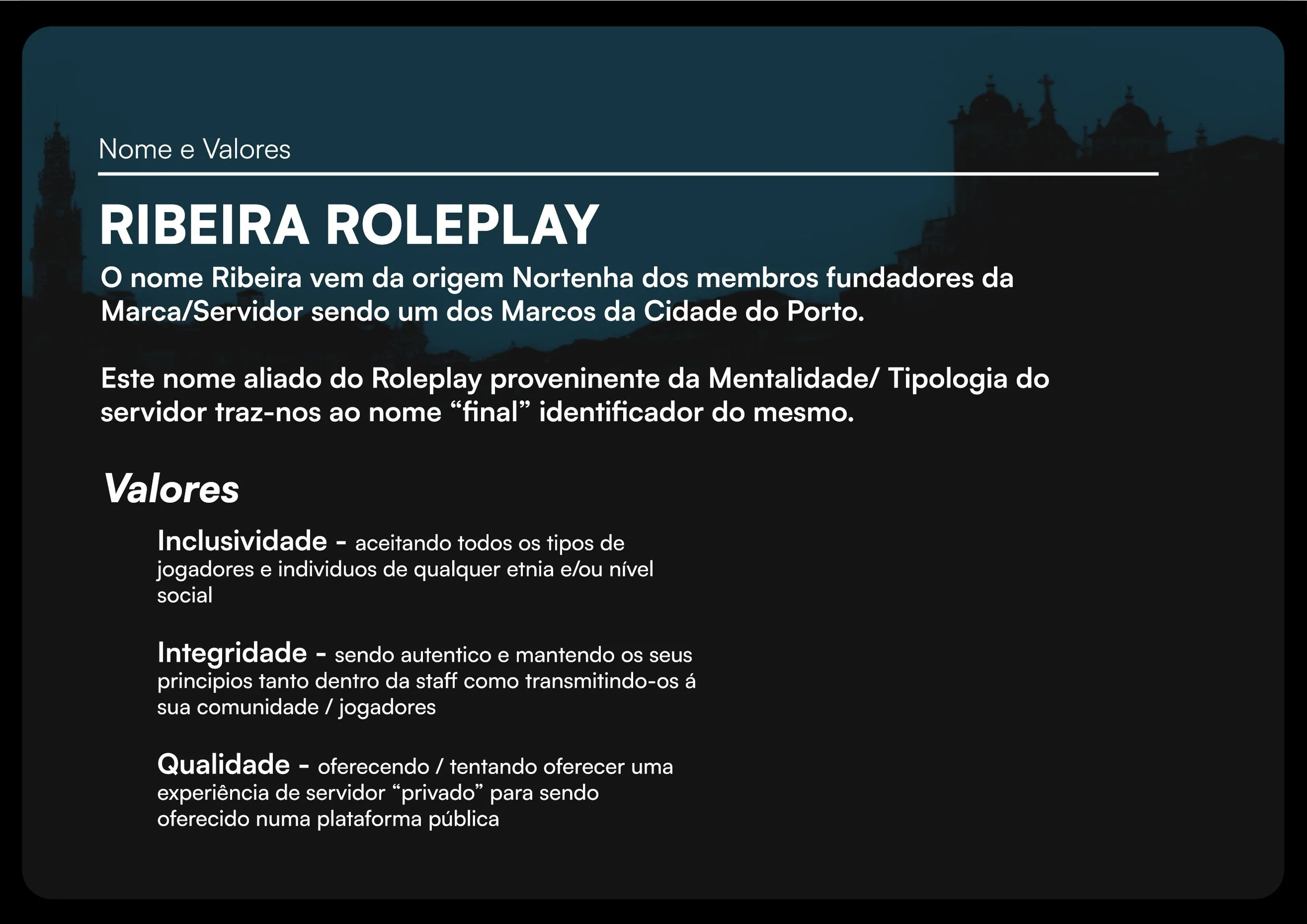
Establishing the concept behind the new branding was the first priority, as such I’ve focused on researching into the name, and all the options and conceptualizing what could be brought into the design.
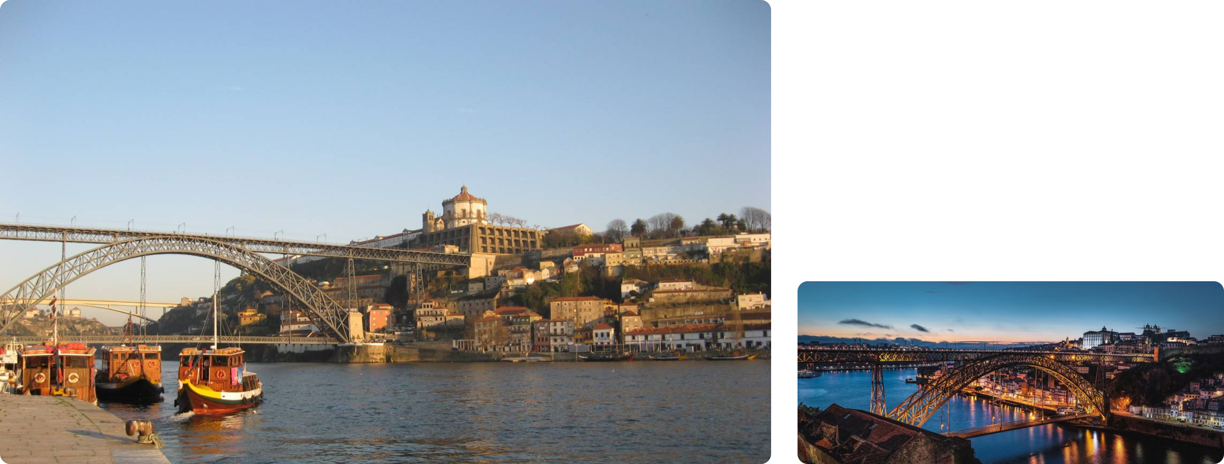
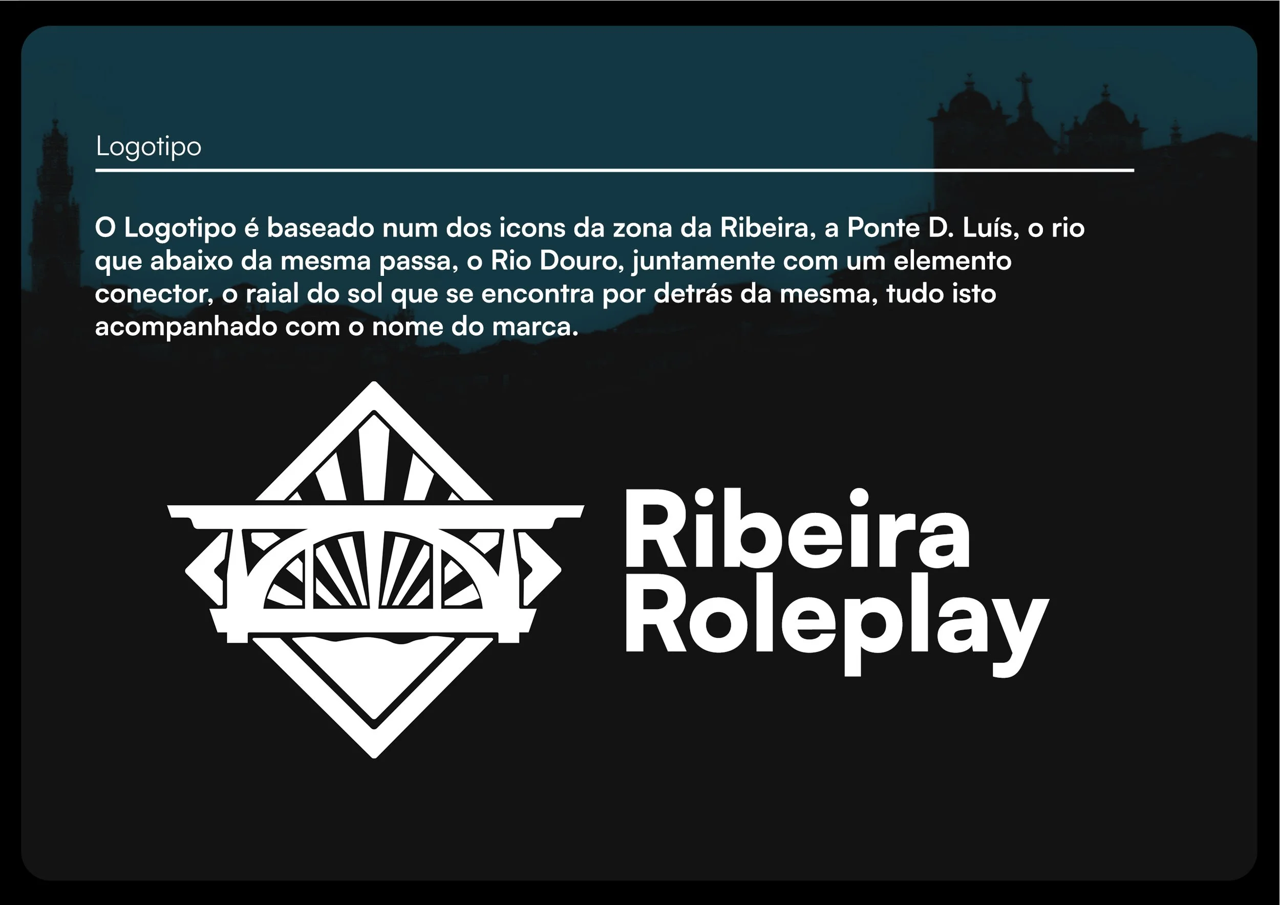
The main concept was going with the idea of the “Ribeira” which is a really known area in the city of Oporto, I’ve taken some inspiration from the 2 most iconic things you can see there, the Douro River, and the D. Luís Bridge.

From this point, I started creating a simple illustrative version of both of these, going to the core, and tracing the basic shapes of the bridge, and shapes to illustrate both the river, and the sun shining behind it
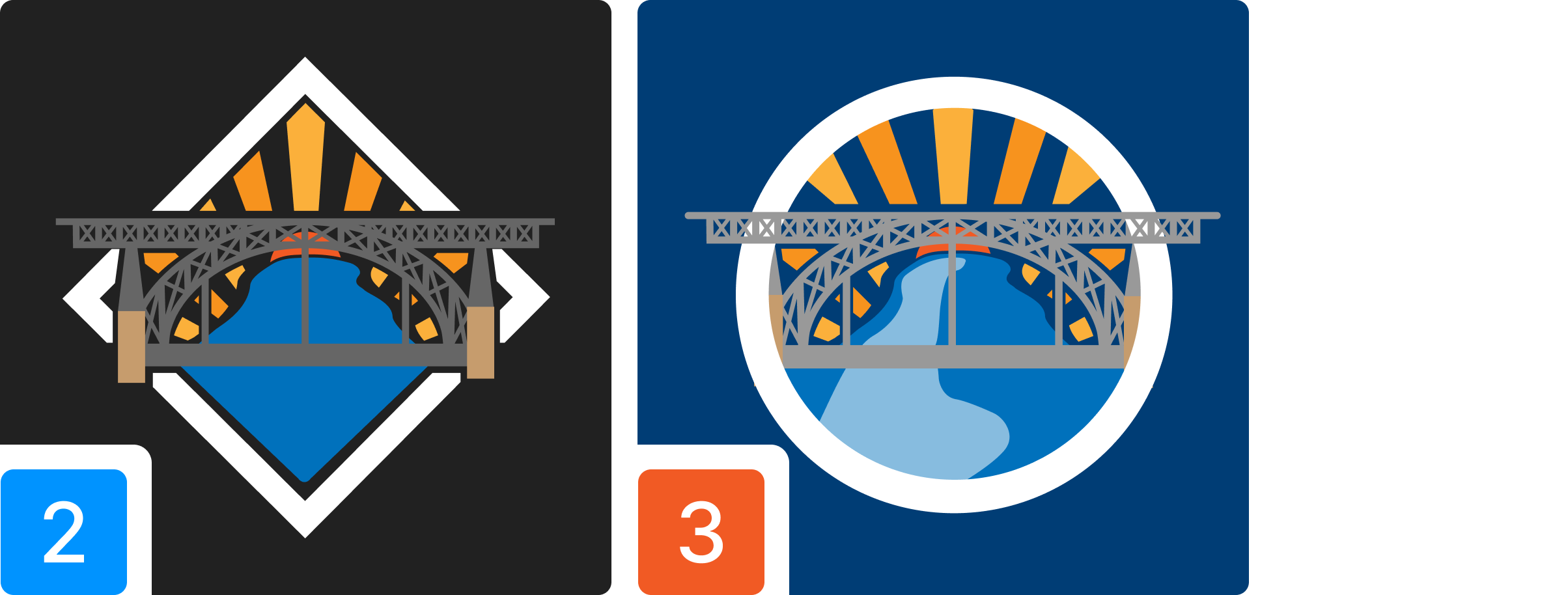
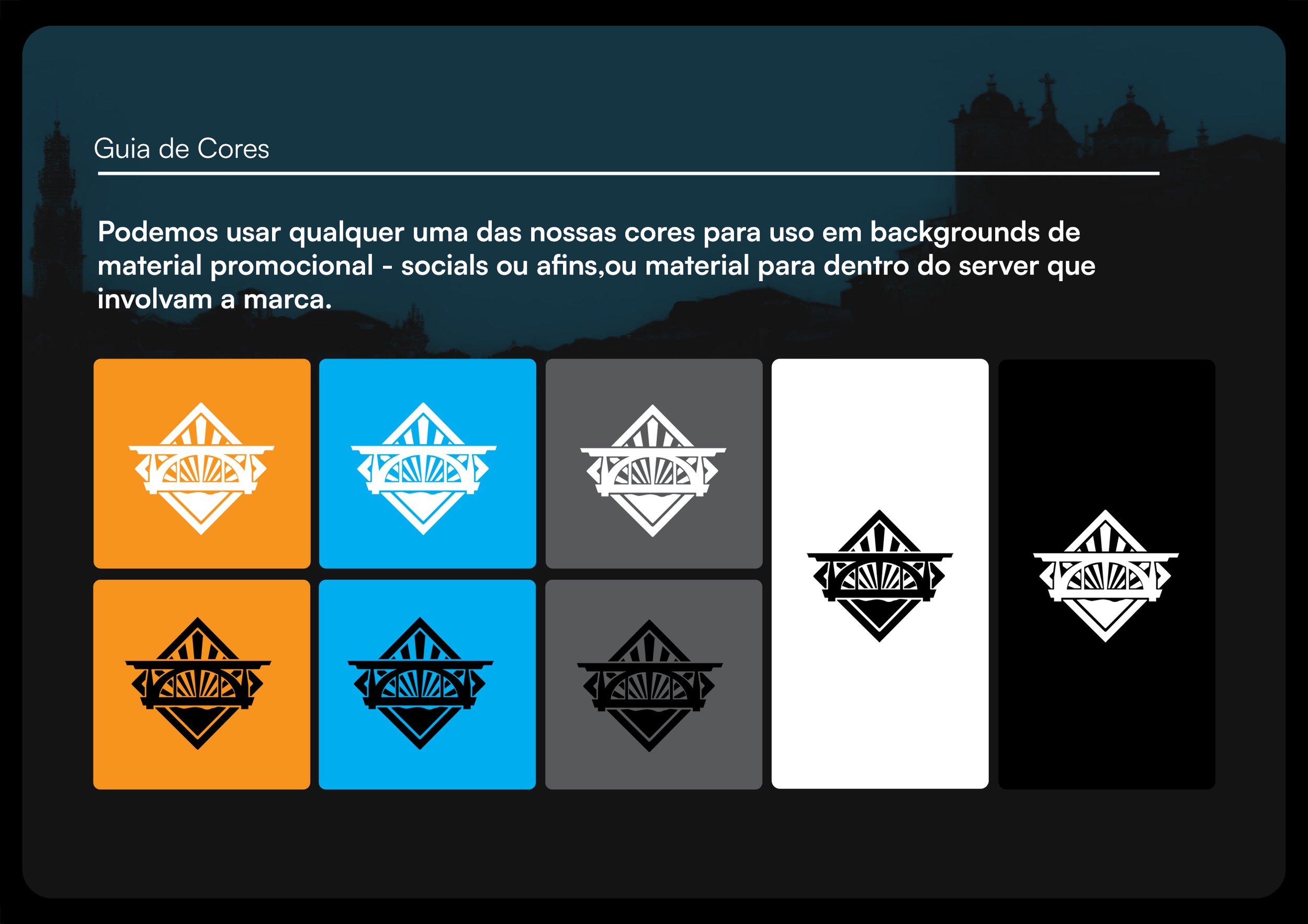
In the following itinerations, I’ve added up more detail to the logo, trying to capture the industrial design of the bridge, working on the background and the colors, trying to establish how much detail I could into the logo before, it was “too much”.
I kept experimenting with straight and circled shapes for the outer border.

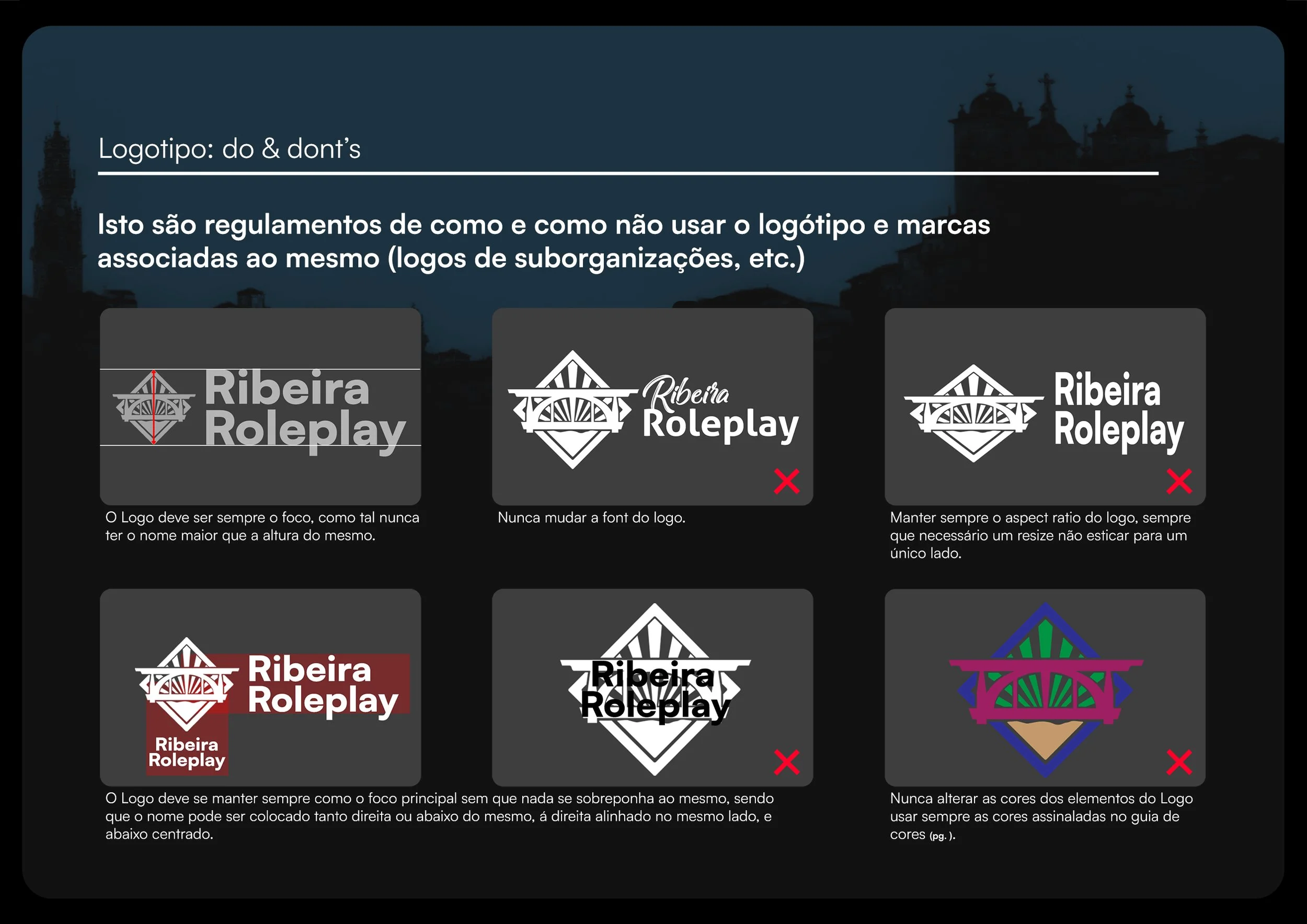
Eventually, ended up cutting back on some of the detail, in exchange for resizability readability, since most of the minor details would be lost , so I kept the basic shape of the iconic bridge, a simpler river, and rays, keeping the same values and ideas, in either colored or the flat variations.
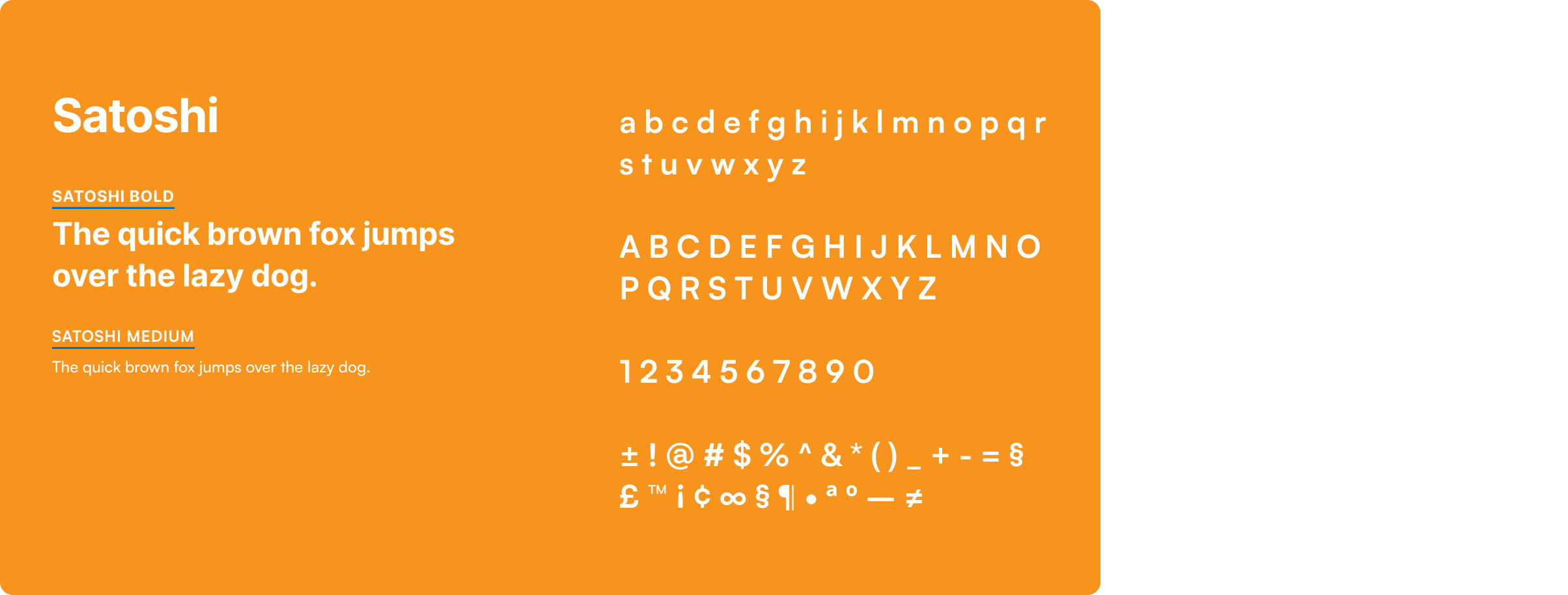
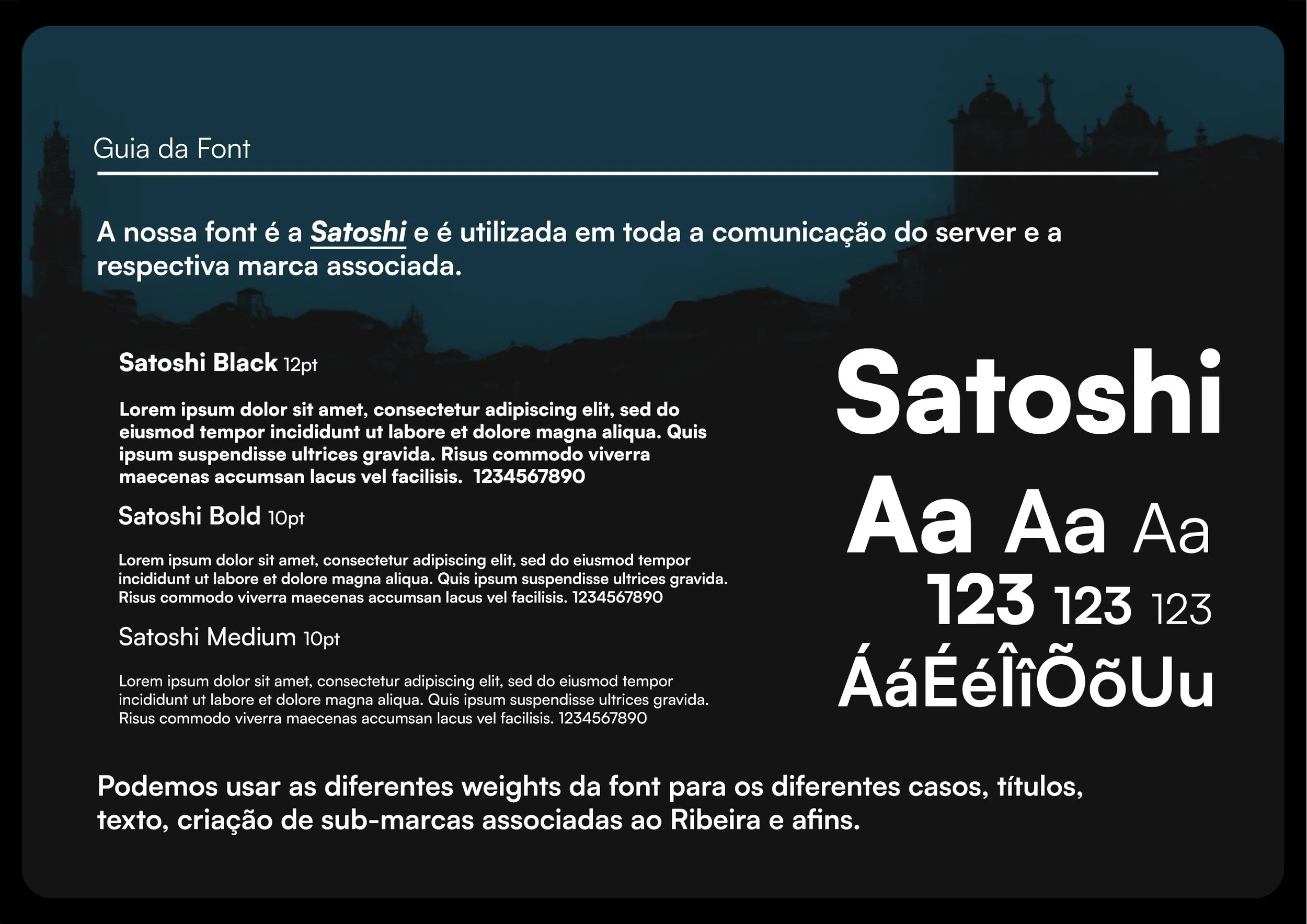
We chose Satoshi has the main typeface for the brand, we used it as a natural evolution from the formerly used Poppins.
It is a sans serif, that perfectly fits the shapes of the logo, and help establish the design language for the whole brand.
Brandbook
In order to keep the design team aligned, I have created the brandbook with all the guidelines and core values of the brand, in order to be used internally, and when needed externaly for possible cooperations or other issues.
The brandbook is in Portuguese since that is the target audience and the team’s main language.

UX&UI
After having an established brand image, I’ve further worked on leaving the same imprint in all media of the server, as such I’ve worked on all the UX/UI for “In-Game Scripts” and visible content, detailing and prototyping various UI elements and assisting on doing frontend development alongside the dev’s so that their main focus is getting the backend up and running.