

LowLands
Branding
Conceptualization
UX/UI
2022
Year
Roles

I’ve worked on a possible rebranding for Lowlands, a festival based in Biddinghuizen, The Netherlands, that’s been ongoing for almost 30 years.
In this rebranding I’ve researched and explored ongoing themes and ideas used by some of the other creatives that worked in previous designs for the Festival, along with core values and general vibes of the Lowlands itself.
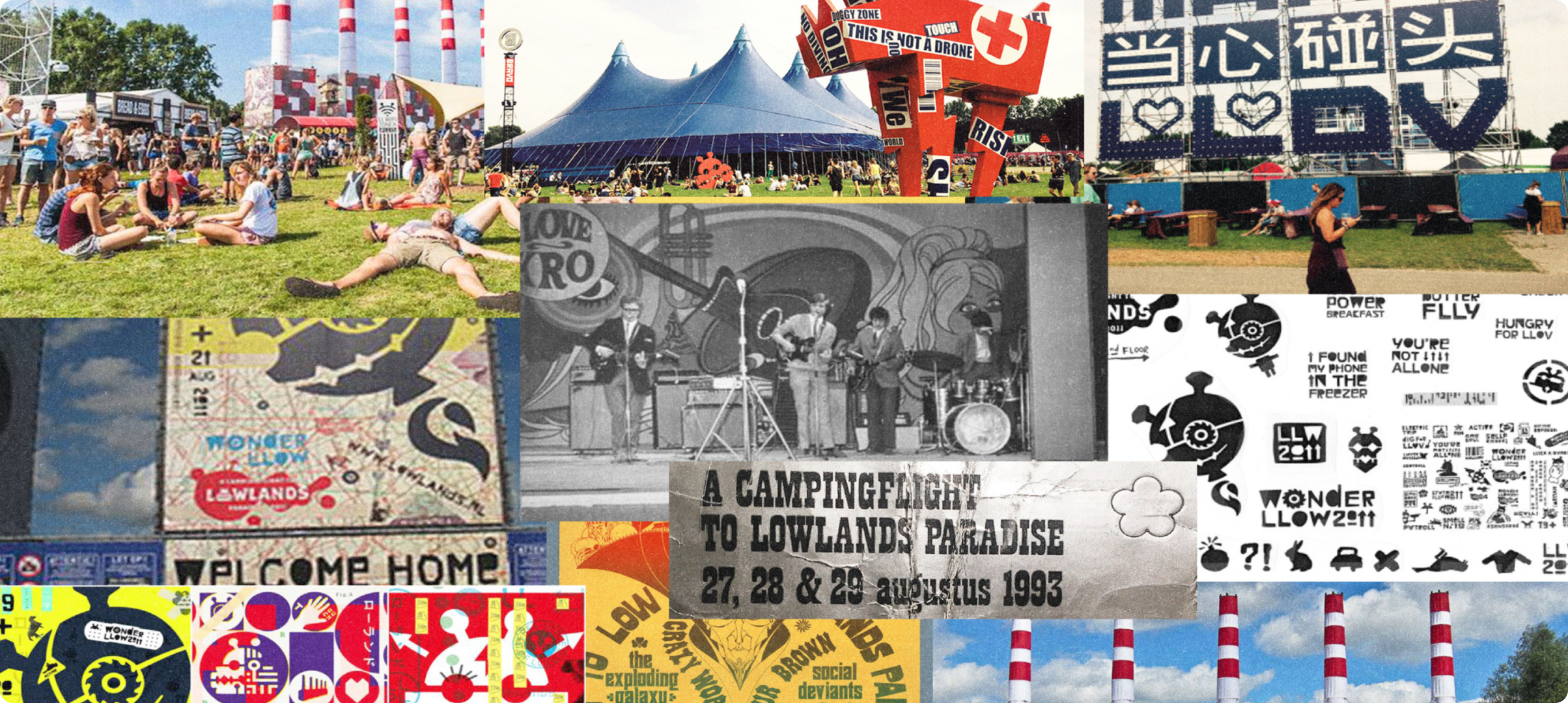
After researching more about the roots of the festival, I’ve decided on exploring their “A State of LLow” pay-off, a concept based on unity and share.
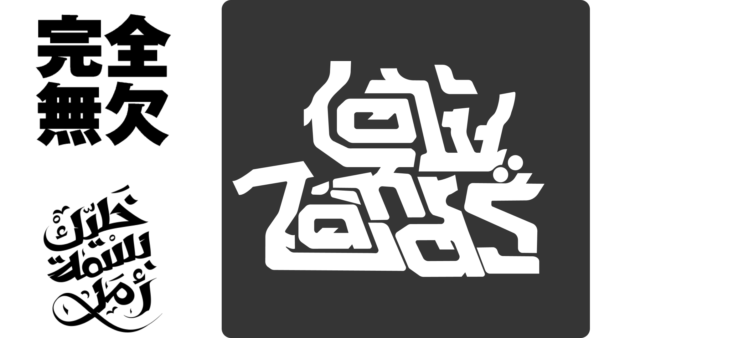
As such, I’ve attempted to establish a connection between the concept and the logo.
My take on this is a shape that is interconnected with only small gaps, in order to elevate that idea, I’ve established the alusion of a foreign alphabet by taking shape elements of asian and arabic alphabets.
The final result has those foreign hints, presented in a highly readable contrasting type-logo.

Color wise, I’ve inclined into vibrant, confortable colors, that helped setting in stone the look and feel of this re-branding.
Being able to trace all 3 colors to variations of base colors, along with the black and white as values that can be further tinkered, gives it in general alot more versatility.
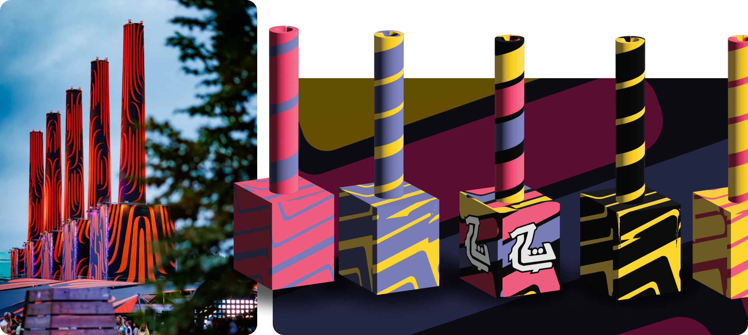
One of the most Iconic things of Lowlands are their 5 towers, as such a redesign to introduce the new brand would be a no-brainer.
Maintained it mostly simple and straightfoward to to now strain away from the core design ideas of the rebranding.

Ticket bracelets, each variation with it’s distinct design for easy identification at the festival grounds.

Time-map of the Festival, along with a floorplan/map of the festival grounds, to be both inserted into the brochure (which cover can be seen here under) that would be distributed in the festival.

All the aforementioned elements can be seen in the Festival App, where all design elements can be seen being used, and exemplify how the brand would be represented in a actual “product”.